Toma de decisiones clínicas basadas en pruebas científicas
EVIDENCIAS EN PEDIATRÍA

Marzo 2017. Volumen 13. Número 1
| Pruebas diagnósticas con resultados continuos o politómicos. Curvas ROC
Valoración: 0 (0 Votos)Autores: Molina Arias M, Ochoa Sangrador C.
 Suscripción gratuita al boletín de novedades
Reciba periódicamente por correo electrónico los últimos artículos publicados
Suscribirse |
Autores:
Correspondencia:
En números anteriores vimos cómo se valoraba el comportamiento de las pruebas diagnósticas cuando estas tenían como resultado un valor positivo o negativo. Calculábamos la sensibilidad (S) y especificidad (E) de la prueba1, los valores predictivos2 y los cocientes de probabilidades3, todo ello encaminado a saber la probabilidad posprueba.
Pues bien, existen pruebas diagnósticas en las que el resultado no es positivo o negativo, sino un valor cuantitativo de tipo continuo. Pensemos, por ejemplo, en la glucemia, el colesterol sérico, el número de neutrófilos totales, etc. En estos casos, la S y E de la prueba van a depender del punto de corte que consideremos por encima del cual la prueba será positiva y por debajo del cual será negativa.
Veamos un ejemplo. Pensemos que utilizamos el valor de la procalcitonina (PCT) para distinguir si un lactante con fiebre sin foco tiene una infección vírica o bacteriana. Si elegimos un punto de corte muy bajo, a partir del cual consideremos que la infección es bacteriana, detectaremos la mayor parte de los niños con infección bacteriana (pocos tendrán la PCT por debajo de ese valor), pero estaremos diagnosticando de infección bacteriana muchos niños con infección vírica (falsos positivos [FP]). En este caso, la prueba será muy sensible, pero poco específica.
Por el contrario, si elegimos un punto de corte muy alto, nos equivocaremos muy poco cuando diagnostiquemos una infección bacteriana (pocas tendrán valores por debajo del punto de corte), pero se nos pasarán muchas que diagnosticaremos como víricas (falsos negativos [FN]). En este caso, la prueba tendrá poca sensibilidad y mucha especificidad.
Para solucionar el problema de saber cuál es el punto de corte que más nos conviene disponemos de una herramienta denominada curva de características operativas para el receptor, conocidas como curvas ROC4 por sus siglas en inglés (receiver operating characteristic).
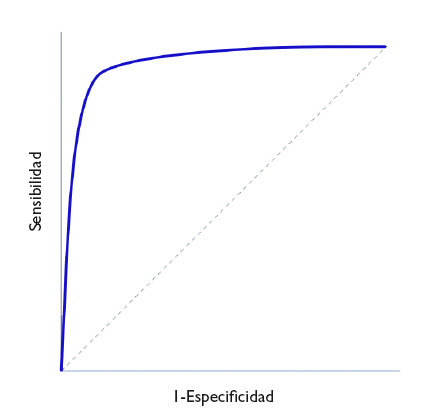
En la figura 1 se representa en ordenadas (eje y) la S y en abscisas el complementario de la E (1-E) y se traza una curva según la S y E de cada valor que se tome como posible punto de corte. Así, cada punto representa la probabilidad de diagnosticar correctamente a sanos y enfermos. La diagonal del gráfico representaría la “curva” si la prueba no tuviese capacidad discriminatoria.
Figura 1. Representación de una curva ROC. Mostrar/ocultar
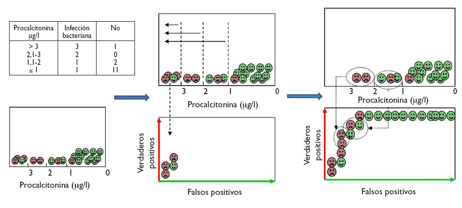
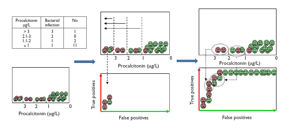
Veamos cómo construir una curva ROC con un ejemplo ficticio del uso de PCT para distinguir entre infección vírica y bacteriana, cuyos resultados aparecen en la tabla incluida en la figura 2. Para visualizar de forma gráfica cómo hacer una curva ROC, dentro de cada intervalo de los valores de PCT comenzamos a colocar los casos de infección bacteriana (verdaderos positivos) sobre el eje vertical (hacia arriba en el gráfico) y los casos de infección viral (falsos positivos) hacia la derecha en horizontal, tal como se muestra en la figura 2. En cada intervalo, los verdaderos positivos nos acercan a la esquina superior izquierda del gráfico, mientras que los falsos positivos nos alejan. Obtenemos así la curva para este ejemplo.
Figura 2. Ejemplo gráfico de construcción de la curva ROC a partir del diagnóstico de los pacientes para los diferentes puntos de corte de la prueba. Mostrar/ocultar
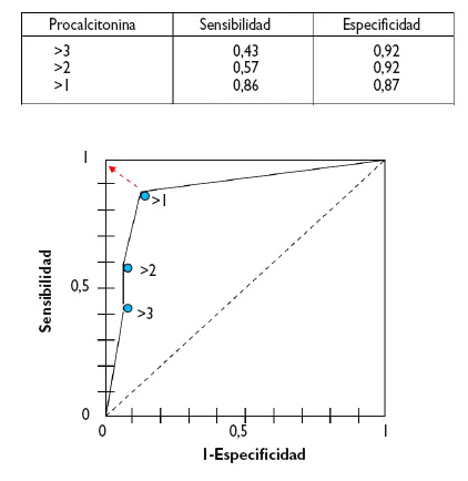
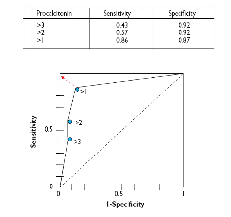
Desde un punto de vista numérico calcularíamos las parejas de S y E para cada uno de los posibles puntos de corte y los representaríamos gráficamente, tal como se muestra en la figura 3.
Figura 3. Representación gráfica de las parejas de S y E para construir la curva ROC de la prueba diagnóstica. Mostrar/ocultar
Como puede verse en el gráfico, la curva suele tener un segmento de gran pendiente donde aumenta rápidamente la S sin que apenas varíe la E: si nos desplazamos hacia arriba podemos aumentar la S sin que prácticamente nos aumenten los FP. Pero llega un momento en que nos acercamos a la parte plana. Si seguimos desplazándonos hacia la derecha llegará un punto a partir del cual la S ya no aumentará más, pero comenzarán a aumentar los FP.
Así, podemos utilizar esta curva para calcular cuál es el punto de S y E que más nos convenga según nos interese primar una u otra. En general, en aquellos casos en que los inconvenientes de los FP sean menores que los de los FN nos interesará una prueba muy sensible, por lo que elegiremos puntos de corte situados más a la derecha de la curva. Por otro lado, cuando sea preferible tener FN que FP nos interesará que la prueba sea más específica, por lo que elegiremos puntos de corte más a la izquierda (menos FP). Por último, en los casos en que queramos maximizar S y E, el mejor punto de corte será el punto más próximo al ángulo superior izquierdo de la gráfica5.
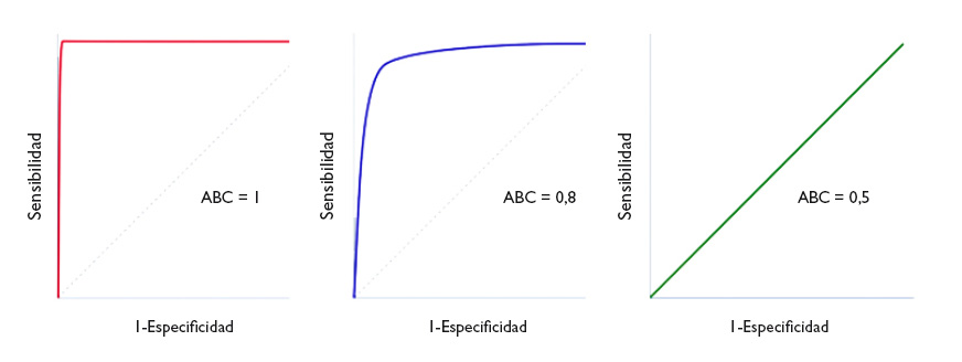
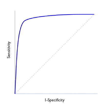
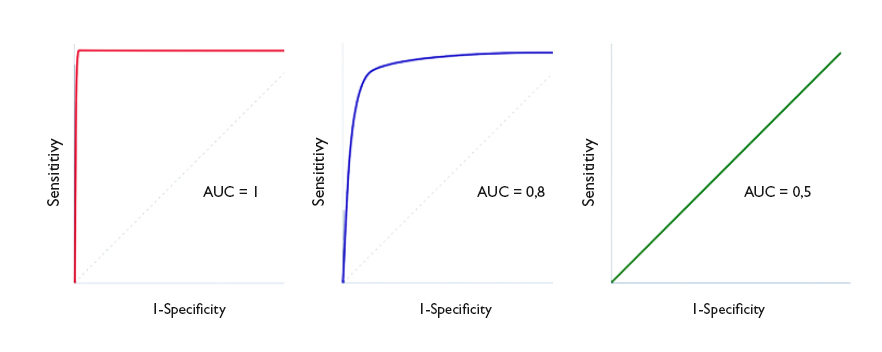
Un parámetro de interés es el área bajo la curva (ABC), que nos representa el comportamiento global de la prueba diagnóstica, la probabilidad de que clasifique correctamente al paciente al que se le practique, considerando todos los puntos de corte posibles. Las curvas ROC se representan siempre como un cuadrado de 1 × 1 de lado. Una prueba ideal con S y E del 100% sigue el marco del gráfico y tiene un área bajo la curva de 1: siempre acierta. Sin embargo, esta situación no suele verse en la práctica habitual, ya que es excepcional encontrar una prueba con S y E de 100%. En clínica, una prueba cuya curva ROC tenga un ABC > 0,9 se considera muy exacta, entre 0,7-0,9 de exactitud moderada y entre 0,5-0,7 de exactitud baja. Así, la capacidad discriminatoria de la prueba disminuye al disminuir el ABC. Cuando la curva coincide con la diagonal, el ABC es igual a 0,5, lo que significa que la capacidad discriminatoria es nula: obtendríamos la misma probabilidad de acertar realizando la prueba o tirando una moneda al aire. Valores por debajo de la diagonal (ABC < 0,5) se corresponden con un error de clasificación de sanos y enfermos: la capacidad de la prueba es tan baja que toma a los sanos por enfermos, y viceversa. En la figura 4 podemos ver ejemplos de curvas con distintas ABC.
Figura 4. Tres ejemplos de curva ROC. Discriminación perfecta (área bajo la curva [ABC] = 1), buena discriminación (ABC = 0,8) y capacidad de discriminación similar al azar (ABC = 0,5). Mostrar/ocultar
De manera ideal, debemos obtener el intervalo de confianza del ABC y comprobar que no incluye el valor 0,5, ya que en este caso la diferencia no sería estadísticamente significativa y la prueba no tendría mayor capacidad discriminatoria que el azar. De manera alternativa, puede hacerse un contraste de hipótesis mediante el test de Mann-Whitney, que nos proporcionará el valor de p correspondiente. El problema es que estos procedimientos son matemáticamente complejos y no están al alcance de todos los programas de estadística habitualmente empleados6.
El ABC puede servir también para comparar el rendimiento de dos pruebas diagnósticas7. En estos casos comparamos las curvas y el ABC de cada una. Aquella que tenga un ABC mayor será la que más potencia diagnóstica tendrá. Así, lo correcto es calcular los intervalos de confianza del 95% y comprobar si existe solapamiento (en cuyo caso la potencia de las dos pruebas será similar) o si uno es mayor que el otro (indicándonos cuál es la prueba más potente). La comparación de las curvas puede ser difícil en algunas ocasiones, por lo que existen métodos matemáticos para realizar los contrastes estadísticos y determinar si existe diferencia significativa entre las dos curvas8-9.
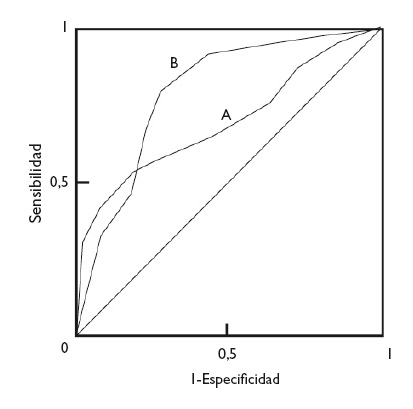
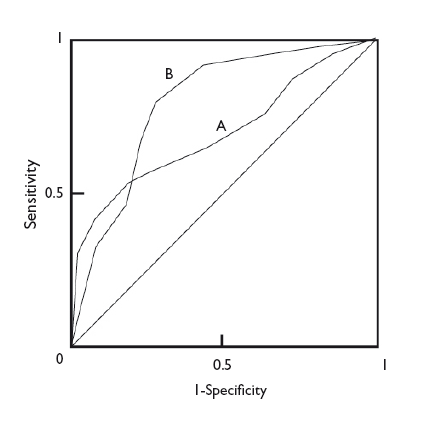
En cualquier caso, con independencia de la diferencia en las ABC de dos pruebas diagnósticas, la forma de las curvas puede darnos también información de interés. En la figura 5 podemos ver superpuestas las curvas ROC de dos técnicas diagnósticas, A y B. Aunque la B tiene un ABC mayor y podría considerarse como una prueba diagnóstica más potente que A, podemos fijarnos en que, a valores muy bajos de S, la prueba A tiene un valor de E más alto que la B. De esta manera, si nos interesa maximizar S y E, escogeremos la prueba B, pero si lo que realmente nos interesa es un valor alto de E, quizás nos sea más interesante utilizar la prueba A.
Figura 5. Comparación de las curvas de dos pruebas diagnósticas. La prueba B es más potente (mayor área bajo la curva), pero puede observarse que la prueba A es más específica para valores bajos de sensibilidad. Mostrar/ocultar
Para finalizar, comentar también que las curvas ROC pueden utilizarse, además de para la valoración de pruebas diagnósticas, para valorar la capacidad de un modelo de regresión logística para discriminar entre dos grupos, casos y no casos10. De manera similar a lo que hablamos anteriormente sobre pruebas diagnósticas, un ABC de 1 indica una capacidad discriminatoria perfecta del modelo. Cuanto menor sea el ABC, tanto menor será el poder de discriminación, hasta llegar al ABC de 0,5, momento en que la capacidad de discriminación es similar a la del azar.
In previous issues, we explored how to assess the performance of diagnostic tests whose results are inherently positive or negative. We calculated the sensitivity (Sen) and specificity (Spe) of the test,1 its predictive values2 and the likelihood ratios,3 all with the purpose of determining the post-test probability.
Then again, there are diagnostic tests that do not give a positive or negative result, but values on a continuous quantitative scale. Consider, for example, blood glucose or serum cholesterol levels, absolute neutrophil counts, etc. In these cases, the Sen and Spe of the test depend on the cut-off points above which the result will be considered positive and below which it will be considered negative.
Let us consider an example. Suppose we use the level of procalcitonin (PCT) to determine whether an infant with fever of unknown source has a viral or a bacterial infection. If we choose a very low cut-off point above which we will consider the infection to be bacterial, we will identify most of the children that have a bacterial infection (few of them will have PCT levels below that threshold), but we will be diagnosing bacterial infection in many children with viral infections (false positives [FPs]). In this case, the test will be very sensitive, but not very specific.
Conversely, if we choose a very high cut-off point, we will seldom err in diagnosing a bacterial infection (few will have values below the cut-off point), but we will miss many cases that will be diagnosed as viral infections (false negatives [FNs]). In this case, the test will have a low sensitivity and high specificity.
In order to figure out which the most convenient cut-off point is, we have at our disposal a tool known as receiving operator characteristic (ROC) curves.4
In Figure 1, Sen is represented in the y-axis, and the complement of Spe (1-Spe) in the x-axis, plotting a curve using the Sen and Spe for each value considered as a possible cut-off point. Thus, each point represents the probability of correctly diagnosing healthy and diseased individuals. The diagonal line in the graph is the shape the “curve” would take if the test had no discriminating ability.
Figure 1. ROC Curve representation. Show/hide
Let us see how we can construct a ROC curve based on a fictitious example of the use of PCT to distinguish between viral and bacterial infections, for which the table in Figure 2 shows the test results. To visualise how a ROC curve is constructed, for each interval of PCT values, we start by placing each of the cases of bacterial infection (true positives) on the vertical axis (upward in the graph) and the cases of viral infection (false positives) to the right and horizontally, as shown in Figure 2. In each interval, true positives pull toward the top left corner of the graph, while false positives pull away from it. This is how we obtain the curve for this example.
Figure 2. Graphical example of the construction of a ROC curve from the diagnostic test results of patients for different test cut-off points. Show/hide
In a numerical approach, we would calculate the Sen and Spe pairs for each possible cut-off point and represent them graphically, as shown in Figure 3.
Figure 3. Graphical representation of sen and spe pairs for the construction of the ROC curve of the diagnostic test. Show/hide
As we can see in the graph, the curve usually has a segment with a steep slope in which Sen increases rapidly with barely a change in Spe: if we go up, we can increase the Sen with nearly no increase in the number of FPs. But eventually we reach a plateau. If we continue to move right, there will be a point at which the Sen will stop increasing, but the number of FPs will start to increase.
Thus, we can use the curve to calculate which is the Sen and Spe point that is most convenient based on which one we wish to prioritize. In general, for cases in which the disadvantages of a FP are lesser than those of a FN, we would be interested in a very sensitive test, so we would choose cut-off points toward the right of the curve. Conversely, when it is preferable to get a FN to a FP, we would want the test to be more specific, so we would choose cut-off points that are more to the left in the curve (fewer FPs). Last of all, in cases in which we want to maximise both Sen and Spe, the best cut-off point is the one that is closest to the top left corner of the graph.5
The area under the curve (AUC) is a useful parameter that represents the overall performance of the diagnostic test, the probability of it correctly classifying the patient that undergoes it, taking into account all possible cut-off points. ROC curves are always represented as a 1 × 1 square. An ideal test with a Sen and Spe of 100% would have a curve along the frame of the graph and an AUC of 1: it would always be correct. However, this is rarely seen in everyday practice, as we seldom come across tests with both a Sen and a Spe of 100%. In clinical practice, tests with ROC curves with an AUC > 0.9 are considered very accurate, with AUCs between 0.7-0.9, moderately accurate, and with AUCs of 0.5-0.7 slightly accurate. Thus, the discriminating ability of a test decreases as the AUC decreases. When the curve fits the diagonal, the AUC equals 0.5, which means that the test has no discriminating ability: the probability of guessing correctly would be the same performing the test or tossing a coin. Values under the diagonal (AUC < 0.5) correspond to errors in the classification of healthy and diseased individuals: the discriminating ability of the test would be so low that it would deem healthy individuals diseased and vice versa. Figure 4 gives examples of curves with different AUCs.
Figure 4. Three ROC curve examples. perfect discrimination (area under the curve [AUC] = 1), adequate discrimination (AUC = 0.8) and discriminating ability similar to chance (AUC = 0.5). Show/hide
Ideally, we should calculate the confidence interval of the AUC and verify that it does not include 0.5, as in this case the difference would not be statistically significant and the test would not perform better than chance in its discriminating ability. Alternatively, we could perform hypothesis testing by means of the Mann-Whitney U test, which would give us the corresponding p value. The disadvantage of this approach is that these methods are mathematically complex and are not widely available in standard statistical software.6
The AUC can also be used to compare the performance of two diagnostic tests.7 In these cases, we compare both the curves and their corresponding AUCs. The curve with the larger AUC corresponds to the higher diagnostic yield. Thus, the correct approach is to calculate the 95% confidence intervals 95% and check whether the areas overlap (in which case the yield of both tests would be similar) or whether one is larger than the other (indicating which of the tests is more powerful). Comparing the curves may be difficult sometimes, so there are mathematical methods to carry out statistical comparisons and determine whether there is a significant difference between the two curves.8-9
In any case, regardless of the difference in the AUC of two diagnostic tests, the shape of the curves can also give us interesting information. Figure 5 shows the superimposed ROC curves of two diagnostic tests, A and B. Although B has a larger AUC and could be considered a more powerful diagnostic test than A, we can see that when we take very low Sen values, test A has a higher Spe than test B. Thus, if we are interested in maximizing both Sen and Spe, we will choose test B, but if what we are really interested in is having a high Spe, we may want to consider using test A.
Figure 5. Comparison of the curves of two diagnostic tests. test b is more powerful (larger area under the curve), but we can see that test a is more specific for lower sensitivity values. Show/hide
To conclude, we would also like to note that ROC curves can be used not only to assess diagnostic tests, but also to compare the ability of a logistic regression model to discriminate between two groups, cases and non-cases.10 Similar to what we discussed in relation to diagnostic tests, an AUC of 1 would denote that the model offers perfect discrimination. The smaller the AUC, the smaller the discriminating ability, until reaching an AUC of 0.5, at which point the discriminating ability of the model would be the same as that of chance.
Cómo citar este artículo
Molina Arias M, Ochoa Sangrador C. Pruebas diagnósticas con resultados continuos o politómicos. Curvas ROC. Evid Pediatr. 2017;13:12.
Bibliografía
Envío de comentarios a los autores